library("pacman")
suppressWarnings(library("lubridate"))
library(readr)Take-Home Exercise 1 - Part 1
Scenario Overview
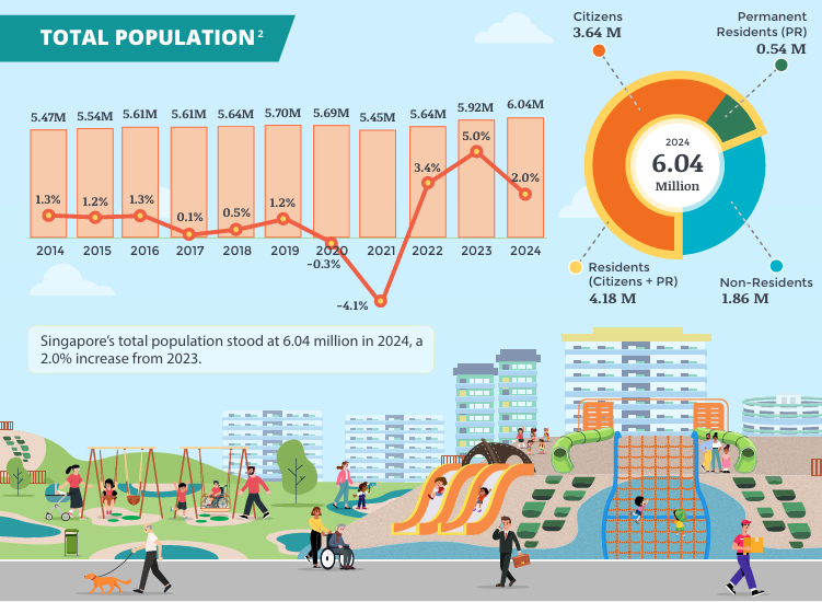
Singapore is home to almost 5.5 million residents as of 2025, and these residents are widely spread across the island.It ranks 129th in the world by population and 32nd in Asia. The population growth rate in 2024 is projected at 0.69 percent, the 129th highest among 237 countries and dependent territories.
Source: Singstat
In this Task, we will be diving into more details on how these residents are distributed across the island. The data that has been used is imported from the SingStat website
1 Getting started
Let us get started on this Task. But first things first, we need to get some housekeeping done before performing the task, which will be outlined below:
1.1 Loading the packages
In this step, I will first use the pacman::p_load() function to load up the R packages that will be used to complete the task. The R packages are as follows:
Tidyverse: This is the core collection of R packages designed for data science
ggplot2 This is an R package for producing visualizations of data. It uses a conceptual framework based on the grammar of graphics.
ggrepel: This is to provide geoms for ggplot2 to repel overlapping text labels
ggthemes: to use additional themes for ggplot2
patchwork: to prepare composite figure created using ggplot2
ggridges: to plot ridgeline plots
ggdist: for visualizations of distributions and uncertainty
scales: provides the internal scaling infrastructure used by ggplot2
readxl: To read all excel files (in xls format)
lubridate: To read and handle dates
Janitor: To clean up column names and data formatting purposes
pacman::p_load(tidyverse, readxl,
               janitor, lubridate,
               ggplot2, ggthemes,
               scales, ggridges,
               ggdist, patchwork)
1.2 Importing the dataset
In this step, we will now be importing the dataset that we have obtained earlier from the SingStat website, and the code is as follows:
Resident_Data <- read.csv("data/Resident_Data.csv")1.3 Data screening
After importing the dataset, I will be using the glimpse function to determine any similar rows that can be found inside this dataset
glimpse(Resident_Data)Rows: 75,696
Columns: 7
$ PA <chr> "Ang Mo Kio", "Ang Mo Kio", "Ang Mo Kio", "Ang Mo Kio", "Ang M…
$ Subzone <chr> "Ang Mo Kio Town Centre", "Ang Mo Kio Town Centre", "Ang Mo Ki…
$ AG <chr> "0_to_4", "0_to_4", "0_to_4", "0_to_4", "0_to_4", "0_to_4", "0…
$ Sex <chr> "Males", "Males", "Males", "Males", "Males", "Males", "Females…
$ FA <chr> "<= 60", ">60 to 80", ">80 to 100", ">100 to 120", ">120", "No…
$ Pop <int> 0, 10, 10, 50, 10, 0, 0, 0, 20, 30, 10, 0, 0, 10, 30, 70, 20, …
$ Year <int> 2024, 2024, 2024, 2024, 2024, 2024, 2024, 2024, 2024, 2024, 20…Next, we also need to ensure that there are no duplicates in the data, so the duplicate function is used, as shown below:
Resident_Data[duplicated(Resident_Data),][1] PA Subzone AG Sex FA Pop Year
<0 rows> (or 0-length row.names)2 Analysing and Visualizing Data
To Analyse the data provided at the csv file taken from the SingStat website, we will be anaysing how the residents of Singapore are scattered based on Area (Planing Area), Functional Age (FA), and sex.
2.1 Using Bar chart based on Population Area
One of the ways that I used to visualise the dataset is using the bar chart based on the ppulation area. Here, we can see which of the residential areas are the most popular for Singaore residents. Bar charts provide a straightforward way to compare population sizes across different planning areas (PA), and are simple and widely understood by most audiences, regardless of their experience with data visualization. The length of the bars makes it easy to spot the highest and lowest population areas at a glance.

filtered_data <- Resident_Data[!is.na(Resident_Data$Pop) & Resident_Data$Pop > 0, ]

ggplot(data = filtered_data, aes(x = reorder(`PA`, Pop), y = Pop)) +
  geom_bar(stat = "identity", fill = "steelblue") +
  coord_flip() +
  labs(
    title = "Population by Planning Area (Singapore, 2024)",
    x = "Planning Area",
    y = "Population"
  ) +
  scale_y_continuous(labels = comma) +
  theme_minimal(base_size = 20) +  # Increase base font size

  theme(
    plot.title = element_text(size = 18, face = "bold"),
    axis.text.y = element_text(size = 15),
    axis.text.x = element_text(size = 10),
    plot.margin = margin(1, 1, 1, 1, "cm")  # Add breathing space
  )
From the visualisation above, we can easily determine that most residents prefers to live around Tampines and Pasir Ris towns, given the proximity to other major transport nodes such as Changi Airport and the direct train connections to the city centre.
What can we learn from this visualization?
- Bar charts provide a simple and straightforward visualization method for analysts
- The length of bars can easily help us to visualize what is the most affected variable
- This data visualization shows that most residents prefer to live in towns such as Tampines and Pasir Ris
2.2 Using Pyramid Bar chart based on Population Area
Another visualisation that I made from this dataset is the pyramid bar chart. The pyramid bar chart aims to visualise the number of residential population based on gender and age groups. This technique helps us for enhanced Comparisons between two Categories, eg. based on gender and age group.

pyramid_data <- aggregate(Pop ~ `AG` + Sex, data = Resident_Data, sum)

age_order <- c("0_to_4", "5_to_9", "10_to_14", "15_to_19", "20_to_24", "25_to_29",
               "30_to_34", "35_to_39", "40_to_44", "45_to_49", "50_to_54", "55_to_59",
               "60_to_64", "65_to_69", "70_to_74", "75_to_79", "80_to_84", "85_to_89",
               "90_and_over")

pyramid_data$AG <- factor(pyramid_data$AG, levels = age_order)

pyramid_data$Pop[pyramid_data$Sex == "Males"] <- -pyramid_data$Pop[pyramid_data$Sex == "Males"]

ggplot(data = pyramid_data, aes(x = AG, y = Pop, fill = Sex)) +
  geom_bar(stat = "identity") +
  coord_flip() +
  labs(title = "Population Pyramid (2024)", x = "Age Group", y = "Population") +
  scale_y_continuous(labels = comma) +
  scale_fill_manual(values = c("skyblue", "salmon")) +
  theme_minimal() +
  theme(axis.text.y = element_text(size = 10))
From this visualisation, we can easily determine that most residents are still within the working age of 30 to 34 years old. However, given that Singapore is projected to have an increase in aging population by 2050 (Siau, 2019), the pyramind graph also shows that there is a high number of population wwithin the age groups of 35 to 65.
What can we learn from this visualization?
The visualization technique on using the pyramid graph can be used to visualize a bar graph by using 2 different categories
This visualization technique is beneficial especially When the population of different planning areas is split into categories and you want to see the relative size of those categories.
This visualization technique shows that most residents in Singapore fall within the age groups of 30 to 65 for both genders.
2.3 Using Box Plot based on Age Range
Another visualization technique I used is the box plot technique. Box plots are used to visually display the distribution and variability of data, and in this case, I will use it to compare population distributions across different functional age bands (FA Bands).

FA_order <- c("<= 60", ">60 to 80", ">80 to 100", ">100 to 120", ">120", "Not Available")
Resident_Data$FA <- factor(Resident_Data$FA, levels = FA_order)

ggplot(Resident_Data, aes(x = FA, y = Pop)) +
  geom_boxplot(fill = "lightgreen") +
  labs(title = "Population by Functional Age Range (FA)", x = "FA Band", y = "Population") +
  theme_minimal()
From the above visualization, we can infer that the population in the >100 to 120 FA Band has a larger spread and higher population values than the <=60 FA Band. For the >100 to 120 band, There is a large spread of population values, indicating higher variability in population within this FA Band. The median line is placed higher in the box, showing that the central tendency is also higher in this age band. There are also presence of outliers in some bands indicates that there are extreme values in the population data for certain age groups, suggesting that these age ranges have a more diverse or skewed distribution.
What can we learn from this visualization?
Box plots are generally used to visually display the distribution and variability of data
The presence of Outliers indicates that there are extreme values in the population data for certain age groups
Box plot visualisation helps analysts to Compare distributions across different categories
This technique also helps to identify and analyze variations, spread, and central tendency within the data.
3 Visualization Summary
The three visualization techniques can help us to better understand and study the contents of the data set provided by singstat. Having these visualization techniques can help us to better understand how Resident data is spread out across Singapore in various ways.
Therefore, we can conclude that these visualisation techniques can be used to examine this dataset, which are the following:
Using Bar chart based on Population Area: This technique provides a straightforward way to compare population sizes across different variables, and are simple and widely understood by most audiences, regardless of their experience with data visualization.
Using Pyramid Bar chart based on Population Area: The visualization technique on using the pyramid graph can be used to visualize a bar graph by using 2 different categories at the same time
Using Box Plot based on Age Range: This visualization technique are mainly used to visually display the distribution and variability of data
4 References
Siau, M. (2019, November 26). Elderly to make up almost half of Singapore’s population by 2050: United Nations. Today Online. https://www.todayonline.com/singapore/elderly-make-almost-half-spore-population-2050-united-nations
Statistics Times. (2024). Singapore demographics. Statistics Times. https://statisticstimes.com/demographics/country/singapore-demographics.php#:~:text=As%20of%202024%2C%20the%20population%20of%20Singapore%20is,129th %20highest%20among%20237%20countries%20and%20dependent%20territories